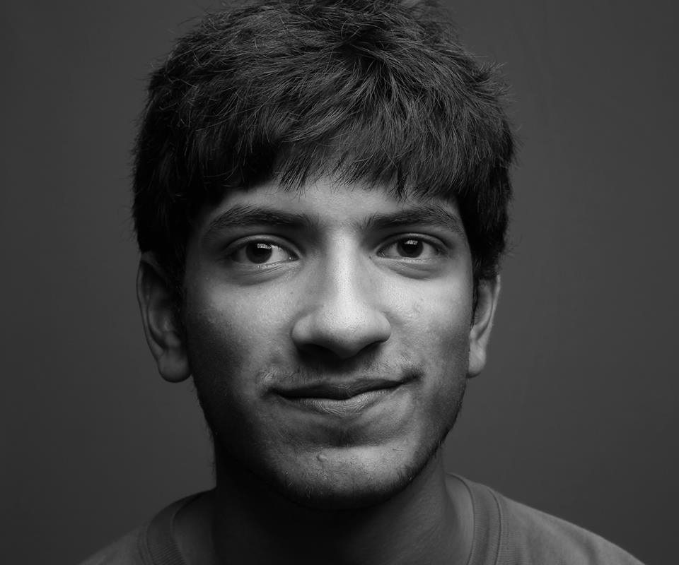
Krishna Bala Shenoi, illustrator of Get Off That Camel spends his days making things. His artwork, spanning a variety of styles, has accompanied children’s literature in books produced by esteemed publishing houses. He lives in Bangalore with his family of humans and cats, where he plans to continue contributing to children’s storytelling, imbuing his work with gentleness and a sense of wonder.
What did you like about the story Get Off That Camel that made you want to illustrate it?
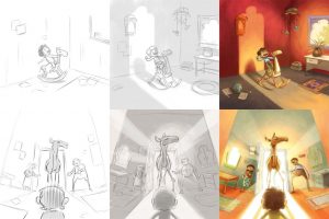
More than anything, it was the opportunity to bring a kind of unbridled wackiness to my illustrations. Most of my books so far have been quiet and sober and gentle, so it was nice to be able to draw a delirious girl riding a giant camel through a crowd of panicked people. And I liked that there was an opportunity to draw a world around our central characters, reacting to them with a variety of emotions. The book demanded a level of detail and richness of me that I haven’t really given before.
Was there anything challenging about illustrating this particular story?
Quite a bit, actually. First of all, I didn’t know how to draw a camel at all. Besides the usual practice of studying images and sketching from them repeatedly, I bought a little model of a camel that I used for reference. It helped a lot with some of the more unique angles in the book (like the top angle used in the supermarket, for example).
Another challenge was managing the wild scales of the book – the camel and the girl are wildly different in stature, and yet both of their emotions had to be readable throughout the images. Beyond that, I had to find interesting ways to fit the camel into spaces and places she wouldn’t fit without it feeling repetitive. Each spread had to feel like a fresh version of, essentially, the same joke.
It was also tricky to load my illustrations with detail and yet not lose Meena and the camel in the chaos. Often, I had to peel back some details elsewhere to bring the image back on track.
I think the most challenging thing about the book, though, was keeping the whole thing a lot of fun while also accounting for the impending separation between Meena and her camel – the doctor
discovers that the camel has been tired for a while. I needed the Meena’s realization in that moment to ring true without contradicting the happy shenanigans in the previous pages.
Could you give us an example of a time where you built on the story and added your own elements that aren’t mentioned in text?
A. H. Benjamin’s text was very sparse in terms of details and tone, and though that demands a lot more thought from an illustrator, it’s ultimately a gift for an illustrator–you can bring that much more to the book yourself. Every illustration is full of little details and reactions and flourishes that had no source in the text, simply because the text was so beautifully taut.
As for a specific example of an element I added… there were little things, like the idea that Meena is an artist. I’ve hidden her drawings of camels here and there in the book, and eagle eyed readers might notice that she actually gets better at drawing as she ages, as one does.
Another element I was particular about adding was some company for the camel at the shelter, at the end. I didn’t want her to go off to a shelter while Meena went back to her family – I needed young readers to know that the camel too had people of her own to be with.
I believe you could give this particular text to five different illustrators and come out with five very unique books. I decided to go with something absurd and over the top, because my first reading of the text made me laugh out loud several times.
Do you have a favourite picture book (or artist) whose illustrations you admire?
I love the stillness Chris Van Allsburg brings to his art. His work is so noiseless and moody and evocative. And more recently, I discovered Oliver Jeffers and his ability to tell such compelling, tender, complicated stories with deceptively simple images. “The Heart and the Bottle” distils the complexity of great loss into something anyone could understand and feel. This isn’t a picture book per se, but Patrick Benson’s illustrations for Roald Dahl’s “The Minpins” create such an enormous, lush, inviting, detailed world. I remember opening that book as a child and just staring at it. James Gurney is one of the artists I admire most, for his ability to make the fantastic seem absolutely real.
Right now, I also get a lot of inspiration from several contemporary Indian illustrators (some also working in picture books). They’re so excellent with their craft and constantly make me want to up my game. A few names, off the top of my head: Lavanya Naidu, Rajiv Eipe, Roopsha Mandal, Sandhya Prabhat, Sarthak Kath, Sayan Mukherjee, Upamanyu Bhattacharyya, Vibhav Singh.
I’m sure I’m going to read this later and slap myself for not recalling other significant influences and inspirations.
What medium do you prefer working with while illustrating?
I’ve done every single one of my nine books (so far) digitally. It allows me to work faster (not fast enough, though), make the numerous corrections publishers ask for more easily, and work and re-work my illustrations the way I like to do. Even so, I almost always try to emulate some of the qualities of classical media because I have a personal preference for them in my own art.
And finally, do you plan on illustrating any more books for Karadi Tales?
No question. I loved working with Karadi Tales. I was given such freedom to make this book my own while also being guided the whole time, and they were incredibly accommodating throughout the process. I’m immeasurably proud of the work we’ve done together and will be working with them on something as soon as I can and as soon as they will have me.