Paying Homage to Dr. A.P.J. Abdul Kalam
Senior Visualiser from Karadi Tales, Vandana Shah, attended the typography workshop at National Institute of Design, Ahmedabad, conducted earlier this month. Here’s a report from her on her experiences!
Day 1 began with registration at the entrance of NID. We received welcome kits in the form of vernacular paper bags, making it a creative beginning to the whole experience. From the entrance to the auditorium was a pleasant walk with glimpses of the campus.
At ten, the welcome session began with Tarun Deep and G. V. Sreekumar. It was a promising and a heartwarming welcome address, which promised us that we will have a great time… and we did! The auditorium started filling up and soon it was so full that a few participants had to sit on the side steps, the excited students and professionals were looking forward to three days of learning with fun.
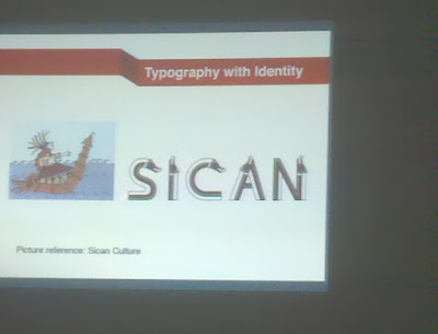
A kadak chai session followed and the first speaker was Mr. Rafel from Peru, who spoke about identity and explained how culture plays a great role in creating type.
This was followed by Professor Fikret Ucar Turkey. His approach was very natural. He presented the organic typography approach which he and his students had explored. Several organic / natural materials and shapes were used to create type without the use of computers. Lot of interesting typefaces were created, the one that’s registered is a letter form out of folded books.
The day moved on with speakers from across the globe with extremely interesting approaches towards typography. People from Sri Lanka, Iran and hamara India spoke about their national languages and their nuances while creating the type. A font called Meeti Mayek created by Neelakash took my attention as he created the script and got it officially approved by the Government of Manipur and included the font in the academic curriculum of the state.
The refreshing tea breaks were the need of the hour. Back with josh, we had Nooper Datye who spoke about her very interesting organization called Aksharaya, which had conducted an outstation camp on Indian letterforms in 3D with participants from the industry. The outcome projected a new insight to Indian scripts and how we as individuals can sustain our culture and creativity. Their 2011 calender was a visual treat.
The day ended with an interactive session between the speakers and the audience. The drive back home via law garden was nostalgic one and ended the day at a smiley note.
The next day began with the session from the most respected speaker of Indian typography. Mr. Mahendra Patel, also known as father of Indian typography, started the session by talking about the impact of technology in creation of the type.
Erin McLaughin session had a fresh approach towards the Devnagri script which was based on research and her journey of creating them made us think beyond boundaries.
From boundaries to point of view via Felix Ackerman was the best session of the morning. This creative mind explored perspective type with an approach to 3D. He spoke about perspective type which displays three different words from three different points of view. This is possible only when the exact placement and orientation of each character allows the viewer to read the message from 3 viewpoints. His understanding of perspective was mind boggling!
A sure tea break was required to register the loaded gyaan.
We then had Yogita and Sreekumar from Bangalore, who started on an intersecting subject – correlation between the Devnagri script and the Bharatnatyam dance form. But to me, the correlation seemed forced and their entire talk was fairly vague.
Following this was Chan Chung’s vibrant mix of Chinese and Western cultures. He brightened up the session speaking about influences of copywriters using multilingual writing to attract the target audiences and designers exploring the creative typographic expression in visual communication.
After a sumptuous North Indian lunch, we returned to a session from South Indian speakers, which was a cultural contrast in itself. Hasin from Kerala spoke about the Malayalam script. Tthe purpose and the complexity faced while creating type was presented. Hasin is a star of Malayalam typeface as his type family is used in the most widely read paper of Kerela ‘Malayalam Manorama’. He has also created the typeface for Matrubhumi, another famous Malayalam journal.
After our Mallu neighbours’ presentation, it was namma Chennai by Rathna Ramanathan, who pepped up the half sleeping north Indian audience by playing nakka mukka song at the beginning of her talk. She very simply explained relation of typography with cultural context and history. She also focused on how certain types of the family are being ignored while the creation of the new typeface designers and are slowly being removed from the script family. The best point of her interaction was how we need to be local at heart to grow international which hit the audiences so hard that they couldn’t stop applauding.
Next was Udaya Kumar, the creator of the new Indian Rupee symbol, whose session was one to remember. He gave all the designers in the auditorium a spectrum of his visual representation of the Indian rupee symbol by sharing his journey from the scratch. He was the most interactive speakers in the whole event. There were many questions from the audience and he answered each of them with ease.
A lot of creative understanding about typography as a subject was understood by me and I got a wide spectrum of creative references in field of graphic design and typography. It was an extremely creative tour as I could meet, learn and interact with so many creative masterminds under one roof.
Related posts


